Logo Design
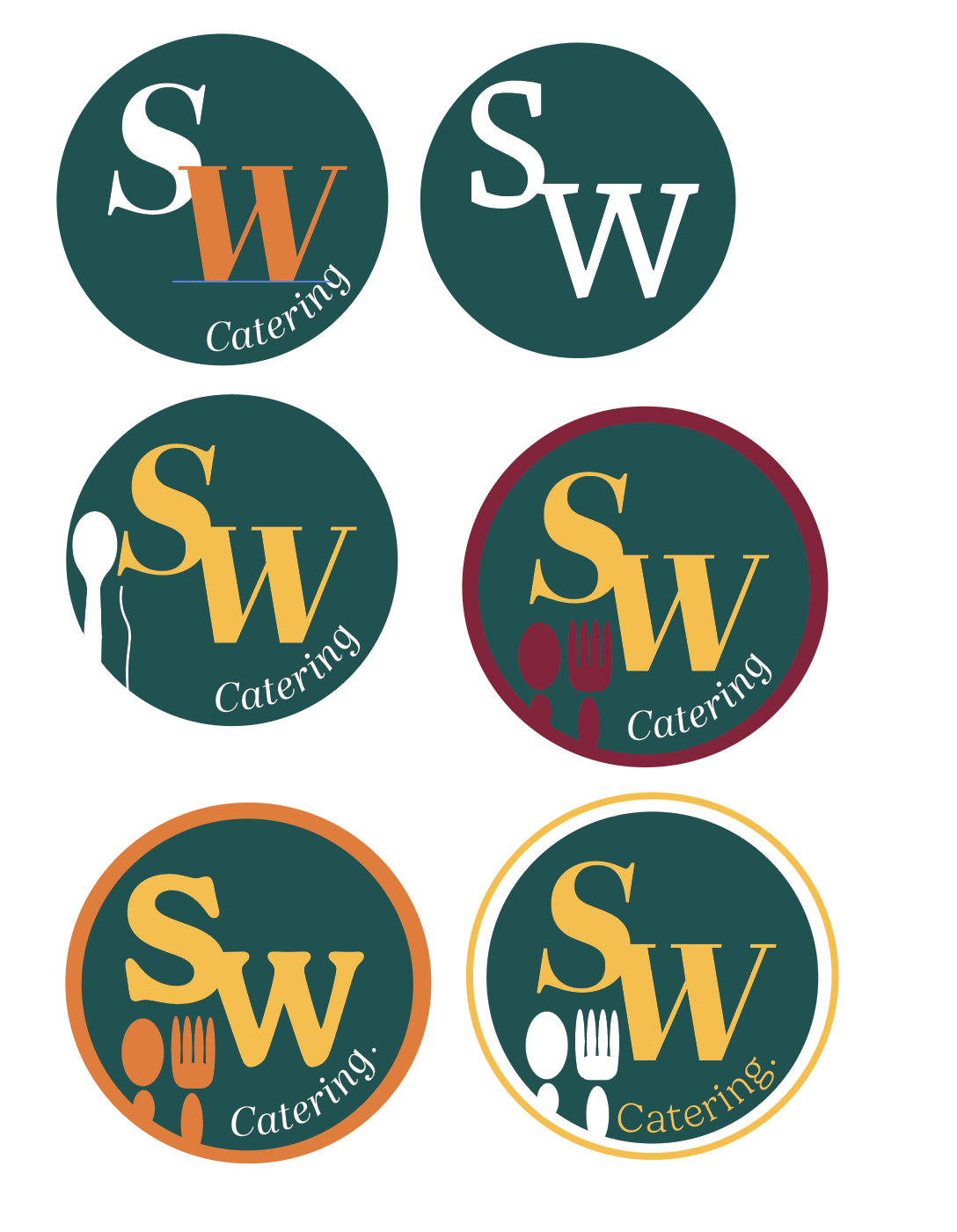
The logo design for a sri-lankan catering service, “SW catering”. The goal was to capture the lively, welcoming and vibrant energy of this local family owned business.

I incorporated a food cloche above the "W" to subtly communicate the catering service offering. Below this, I used utensils such as a spoon and a fork, objects easily associated with food and catering services to highlight the culinary theme.
The colour scheme draws inspiration directly from Sri Lanka’s culture and national colours. Teal green represents the tropical atomoshpere of Sri Lanka, Orange reflects the warmth of spices and traditional curries. Yellow highlights the vibrancy of the Sri Lankan culture, these colours create a warm and approachable aesthetic.

rrttr24–09–2024